Tuesday, September 29, 2009

Favourite Buildings Visited – The 'Blue Tile' Building, Kuwait...


Located a block away from the Gulf Road, adjacent to the Kuwait Institute of Scientific Research, with a sea view, and in Kuwait's Salmiya (one of the central shopping hubs) the 'Blue Tile Building' (not the buildings real name) is situated in one of the city's prime spots. This, however, seems to be where this buildings fortunes end, as it currently is in a regrettably derelict state, a mere reflection of its former self, having been stripped of anything of even the remotest value, its interior wall tiles, stone floors, wiring, balustrades and stairwell railings, windows and any more precious carpentry. It still, nonetheless, is an impressive and attractive building with good architectural 'bones' that, particularly when viewed in the context of its two adjacent, still partially inhabited, sibling buildings (which buffer it from the Gulf Road traffic noise and pollution), forms a successful urban composition. Consistent of duplexes and triplexes facing north (the sea) and south, it must have once provided a very decent set of well proportioned and spacious apartments for well to do middle-class living. Unfortunately, particularly in the context of how most of the local population today prefers to live in, even these large flats are probably inadequate and unsuitable to accommodate the needs of the average umpteen-member family (maids & drivers included).


The building's flanking edges are tiled in a blue geometrical pattern...


It's sad that there doesn't seem to be demand for this type of residential living in Kuwait anymore, as the building forms a congruous, softly monumental, memorable and surprisingly non-intrusive, presence in its neighbourhood, full of beautiful detailing (what's left of it) and a clear consideration for its urban context (its allowance for communal space around its premises is seldom present in any of its more contemporary, usually much blander, renditions currently popping up around the city).


The building's, now exposed, interiors form a seductive patchwork of colours and patterns...


Whilst ruins have their own inherent beauty, this, and its fellow architectural artefacts found in Kuwait, should be respected and restored instead of demolished, as they each perform the role of a mnemonic node, reflective of a particular time and place in Kuwait's history. They, as discussed in a previous post (click here to see it) store some of the collective identity of the nation, forming a recognizable and definable point on the country's historical time-line, and act as manifestations of Kuwait's evolving culture(s).


Close-up of one of the exposed spaces...


Why not adapt, instead of destroy? Why not, as is common in most other evolved metropolises, appropriate the building to fulfil a new set of functions? This might entail altering its currently hollowed spaces according to a new set of residential criteria which are more in line of how a city is inhabited today or, alternatively, chance to use of the spaces completely – modify it into a office building, a hotel, even a department store, or a combination of such uses. Not to save the 'Blue tile Building' and its likes would would be one more corrosive intervention this nation could do without, whilst saving it would provide Kuwait with one more stabilizing plinth in the nation's foundation. Saving a building of this age and calibre, a building that is amongst the few remaining that can count its age in multiple decades (I assume it might have been built in the sixties, early seventies) would provide a pertinent example of how the nation has developed, and would be a viable reference for how current and future generations could/ should go about building their local vernaculars.


External view through one of the now fully exposed interiors...


Partly reflected view from one of the duplexes...


Seaside view from one of the triplexes...


The railing-less internal stairwell...


A dramatic leak...


The residue of a ceiling...


A view of a ceiling, as it stands...


The inner workings of a partition wall...


The two adjacent, still partially inhabited, buildings with a similar tile pattern on their flanking sides...

Tuesday, September 22, 2009

Sketches, Doodles & Drawings... Submission [Two]


Whilst rummaging through some boxes I came across drawings from my yonder-years (created between 1992-97). Most images were made by hand, using a combination of various manual techniques such as pastels, colour-pencils, charcoal and paint.. The themes included are varied and somewhat non-specific, however, 'Frau Peppercorn' is a, never realized, design which I do remember fondly. The last set of images included below were made by computer during my architectural studies at the AA, using predominantly Photoshop, but even these still retain a manual feel in their execution.

Perforated wall detail...

Stretch-face...

Above and Below - A (strangely enough) never realized design, called 'Frau Peppercorn', for a pepper-mill in the shape of a skirted lady, whose head had to be turned (nodded, shaken...) to disperse pepper onto the condiment needing meal placed below her skirt...

The front elevation of Frau Peppercorn...

A view of the skirting detail and a sectional view of the milling head...

The base of the milling head...


Big City Godzilla Versus Mickey Mouse - A commentary on the somewhat adversary relationship between new-built small towns such as Celebration, Florida (owned and run by the Disney Corporation) and any of the more populated metropolises...

Walt the Wedge - the, even after his death, influence (cult of personality) that Walt Disney retained in the creation of smallville USA...

Saturday, September 19, 2009

Favourite Buildings Visited – The Pantheon in Rome...


This is the first post of some of the favourite buildings and places visited, and photographed, both in Kuwait and elsewhere... The aim is not to provide a comprehensive review of each building, as most of them are fairly well known and information can easily be sourced elsewhere, but to render the somewhat impromptu and personal impression and interpretation of what at each locale caught my attention.


The submission included here is of the Pantheon in Rome, which I visited last in June of this year during a brief stop-over in Rome, almost two decades after my previous visit. As a locale it is still absolutely unique, and which, although never seemingly free of its throngs of tourists, nevertheless manages to reflect an ascetic purity and aura that saturated its weathered marble floors, polished powdery smooth by the centuries worth of visitors, and its tree-trunk like Corinthian columns...


As I walked in a hawk flew in through the ocular and circumnavigated the upper echelons of the rotunda. Unfortunately I wasn't fast enough with my camera to capture it before it flew away, but somehow the act of this bird of prey gliding across the volume seemed befitting this subtly iconic space.

Above and below - photos of the twilight threshold between light from the ocular and shaded interiors of the Pantheon...
The exterior brick wall of the Pantheon...

Friday, September 18, 2009

Residential Project in Skerries, Ireland

Images clockwise from top left: Barry the client, the back elevation, elevation close-up, the view...

Paul Brady, the head of our London office, sent some preliminary images from a soon to be completed project in Skerries, Ireland - a contemporary addition into a traditional row of houses... A more complete set of images will be posted at a future date.

All images provided by the client.

Sunday, September 13, 2009

Project Recap No. 7 - Fragrant Follies...

Preamble


The included designs were a part of a series of case-studies, realized between 2004 – 08, titled Sensory Follies that explored some of the more physical and perceptual aspects of computing based design.

The project took as its starting point a polemic that claims that the use of computers within design and architecture has resulted in them becoming excessively visual in their mannerism, i.e. the way design and architecture are conceived when using a computer seem to have developed into something meant predominantly to please the eye, rather than the more comprehensive sensory and perceptual realm (its touch – texture, weight and firmness – its smell, sound, even taste) through which such a design will eventually be experienced, something especially unfortunate in the context of product/ furniture design and architecture as the outcome is inevitably physical. Whilst this might have been a concern even a decade ago, the evolution of the CAD-CAM technologies have permitted a more direct and inherent link to be formed between the way things are conceived with a computer with how things can now be directly realized by the computer based fabrication methods, something which in turn has allowed for a more comprehensive and sensorial understanding of the eventual design to be inferred. In addition, as 'tools' the CAM methods incorporate, beyond the overall degree of accuracy and speed of production they allow for, their own particular set of material and textural idiosyncrasies which can be used as enriching elements in a design. The included projects aimed to take advantage of such factors in their conception.


The design of the Sensory Follies were based on the assumption that, if the notion that we have five senses is accepted, basing a computer based design on the three senses that lend themselves least easily to digital conception would by default produce something intrinsically multi sensorial. In this instance the non-visual senses were the guiding protagonist according to which the designs were conceived. Thus three categories of follies were created, two follies for smell, two for touch, and one for taste - or the Fragrant Tower & Cocoon (explained below), the Finger-Run and the Snakeskin designs (the latter which was initiated under the suppositions of this project, but soon evolved into an entity of its own) which both dealt with the various dimensions of hapticity and touch; the Architectural Tidbit - a gustatory architectural intervention, which will be explained in a (not too distant) future blog post.


Fragrant Follies

The Fragrant Tower...

The Fragrant (or Olfactory) Follies are designs, both fabricated through SLA, which, as explained in an earlier blog entry, used the default scaffolding of the system as components in the design. Here, however, the support matrix was utilized to retain the fragrant oils which are used to saturate the torsos of the designs. The designs aim to subtly affect their environments through the ethereal means of smell, distributing noticeable, but subtle, aromas into the spaces they occupy, leaving fragrant mnemonic traces onto passers by, thus allowing them to bear their influence far beyond the realm their modest sizes initially might suggest.

The aim was to make a design as discrete, yet as expressive and catalytic as a fragrance. A design that could be experienced without being seen. A design that is sensed before it is comprehended.

The designs form faint interventions that interact with its surroundings through evocation rather than provocation. They aim to connect with existing conditions, buildings and beings, stealthily adapting themselves to what is there. Powered and spread by the a breeze, air conditioning, the turbulence from a swinging door, even a sneeze, the designs distribute their subtle aromatic memes. The designs are ‘mechanical’ in the sense a termites nest, a spiders-web or a beavers-dam is mechanical, aiming to fulfil their aims in a comparably congenital manner.


As we inhale, we smell. As we exhale, we don’t. There’s an inherent binary pace and rhythm to experiencing something olfactory. Here the design, the object, is not the protagonist, but the experience of the scent actually takes place ‘within’ its audience, as the fragrance enters their bodies through their nose, mouth and pores. The experience of the design becomes an internalized event, an non-optically derived formulation of an occurrence.


Usually there are three levels to a fragrance - a bottom (base), middle (heart), and top (head)note. The top notes are the most volatile, these are initial ‘layer’ of an aroma one usually smells first. The middle notes diffuse more slowly, and are usually floral essences. They provide the fragrance with a body. The base notes are the most fixed of all the fragrances. They provide the foundations for the top two levels.

In all the Fragrant Follies the bottom and middle notes were the same, with the base note being a ‘Vanilla’ extract with ‘Benzoin Tincture’ as a catalyst. The middle note used was Rose Absolute’. Only the top notes were varied (both from the citrus family), with one being ‘Orange - Sweet’ (Citrus Sinensis), and the other ‘Grapefruit’ (Citrus Paradisi). This was done to provide some variation and embedded richness to the olfactoryscape.


Fragrant Tower


Due to both its eventual size and fact that the design intended to use the default scaffolding to create both the bulk of its torso (in a similar fashion to the SLA bowl explained an earlier blog entry), this rendition of the design involved extensive trial & error to reach a satisfactory conclusion.

Close up of the Fragrant Tower's torso...

A sectional shot of the Fragrant Tower...


Made up of three stacked components, with a shallow male-female link between the components, the tower’s total height was 720 millimeters. Its shape and aims were loosely based upon on the makeup of termites nests, wind-scoops and wind towers, which all provide different means to distribute air, and thus provide suggestions for transferring fragrances. To better understand how the various viscous liquids containing the fragrances would move and occupy the tower, a test was made in which various coloured inks were poured into and through the tower segments. Beyond this action simply having a certain aesthetic appeal , it was an informative exercise, providing suggestions for how to apply and disperse the various aromas through the tower's three segments.

The Fragrant Tower exhibited at the Nous Gallery, London, April-May, 2008...


Fragrant Cocoon

A early sketch of the Fragrant Cocoon...

Designed as a mobile that would slowly sway on a the ledge of a shelf, table or perch, the design, differently from the Fragrant Tower (which in purpose is the same), also uses the ability of the associated software (Materialise's Magics) to manually distribute support scaffolding across a build, here to selectively increase the density of the fine scaffolding of the design making it more compact where needed, thus enabling it to retain the fragrant oils saturating its torso for longer.

A sectional image of the Fragrant Cocoon, showing some of the manually applied support strands added to increase the density of the design's torso...

The designs were displayed in a domestic as well as a public context. Both designs functioned as intended, distributing their subtle affect into their environments and did perceptively modify the ambiance of each space they were displayed in, as in each instance numerous visitors did enquire, and did eventually discover (by following their noses), the sources of the subtle citrus scented perfume that went with the spaces.


The completed Fragrant Cocoon, perched on a finger...

Saturday, September 12, 2009

Talbot Road Residence in Notting Hill, London


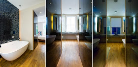
A few images from a recently completed residential project by our sister-company 4M Group, in London's Notting Hill neighbourhood. As most projects taking place in densely populated London this project involved a comprehensive restoration of a listed building, something that, particularly in the context of London's, call them, very 'comprehensive' planning regulations, is always an interesting challenge...

Lower ground level Kitchen...

The kitchen's dining area...

Images of the master bathroom...

Stair details...

The back garden...

All photos by Natalie Sternberg Photography...

Friday, September 11, 2009

Pestival Disassembly...


Our partner Paul Brady, who runs the London end of the business, sent a few images of the Pestival stand mentioned in a earlier blog-entry, being disassembled, a process which in itself is interesting.

The stand will find a new home at the London Zoo...

All photos by Paul Brady...

Monday, September 7, 2009

KUKA in Kuwait...


As someone interested in the various CAD-CAM technologies and the way they are used, one has a tendency to always keep an ear and eye open for examples of both the machines themselves as well as evidence of products produced by such fabrication methods. There are a number of service providers in Kuwait, most found in the Dasman Complex and Shuwaikh area, providing both laser-cutting and 3-axis milling services. Kuwait University's architectural department also has a laser-cutter as well as a 3-axis milling machine. As of yet no more sophisticated subtractive methods (multi-axis CNC technologies) nor additive processes (Stereolithography, Fused Deposition Modeling, 3D Printing) have crossed our path, until recently, when, whilst visiting the Avenues Mall's Magic Planet inside amusement park, where a KUKA industrial robot has been adapted into a ride.
There is nothing necessarily wrong with using such high-tech methods as a children's ride as the KUKA is, after all, the 'Swiss Army Knife' of industrial robots. It does seem, however, that using a KUKA for this purpose is a bit of an overkill and somewhat of a lost opportunity – a bit like using a Bentley for a pizza-delivery. This robot, which can carve, shape and position things up to a thousand kilos in weight at an accuracy of ±0.2 mm, only as a children's ride is a bit strange, particularly if it is amongst the only ones, if not the only one, in Kuwait. This 6-axis multi-tasker is the work-horse of the CAD-CAM fabrication world, and has an established presence all around the globe, except, as far as I know, the Gulf and the Middle-East. It and its likes are also already widely used at various academic and research institutions (both architectural, engineering and computer science departments), where the means for how they could/ should be used and adapted is pushed even further.

If anyone has used, or even just come across, one of these robots somewhere in the region please get in touch. It would be great to set-up something, perhaps a collaborative research project, exploring how a KUKA (or its like) could be used in the designing and building of something more architectural in character and purpose in Kuwait and what it would entail to use something of this calibre in the region.